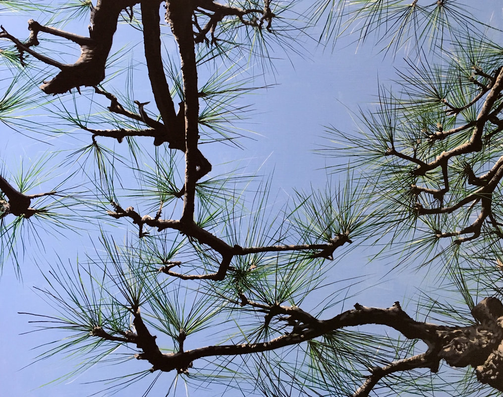
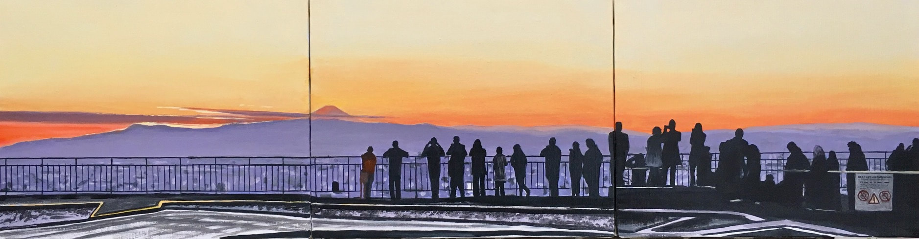
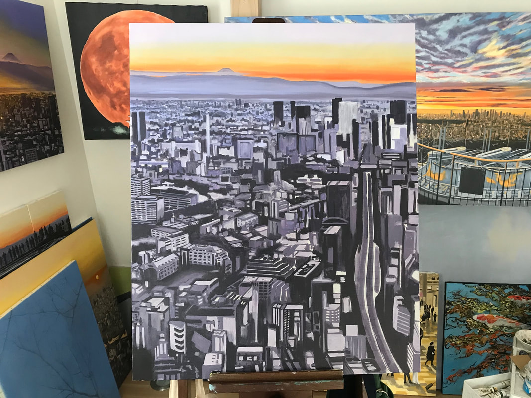
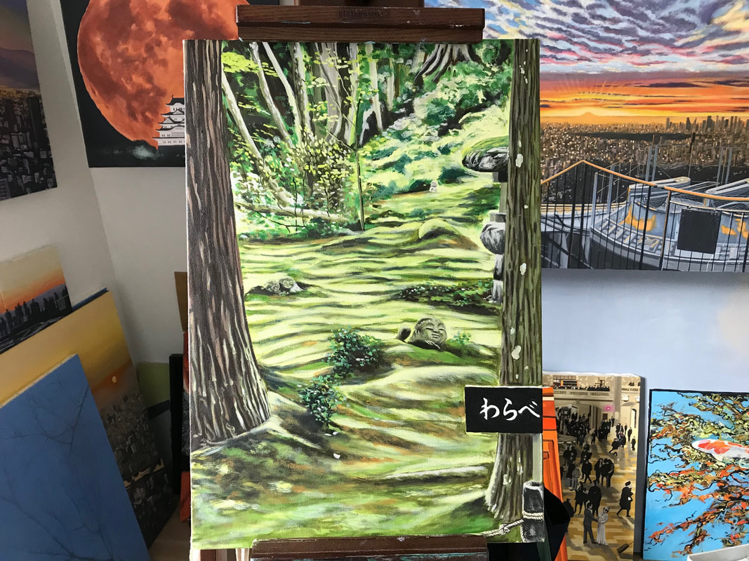
 Hama-rikyu pine I have been busy this year building up a portfolio of work for next year`s TAC exhibition. Hope you like the new work...and if you are interested in purchasing any of these, drop me an email at simon.j.dalby.com. 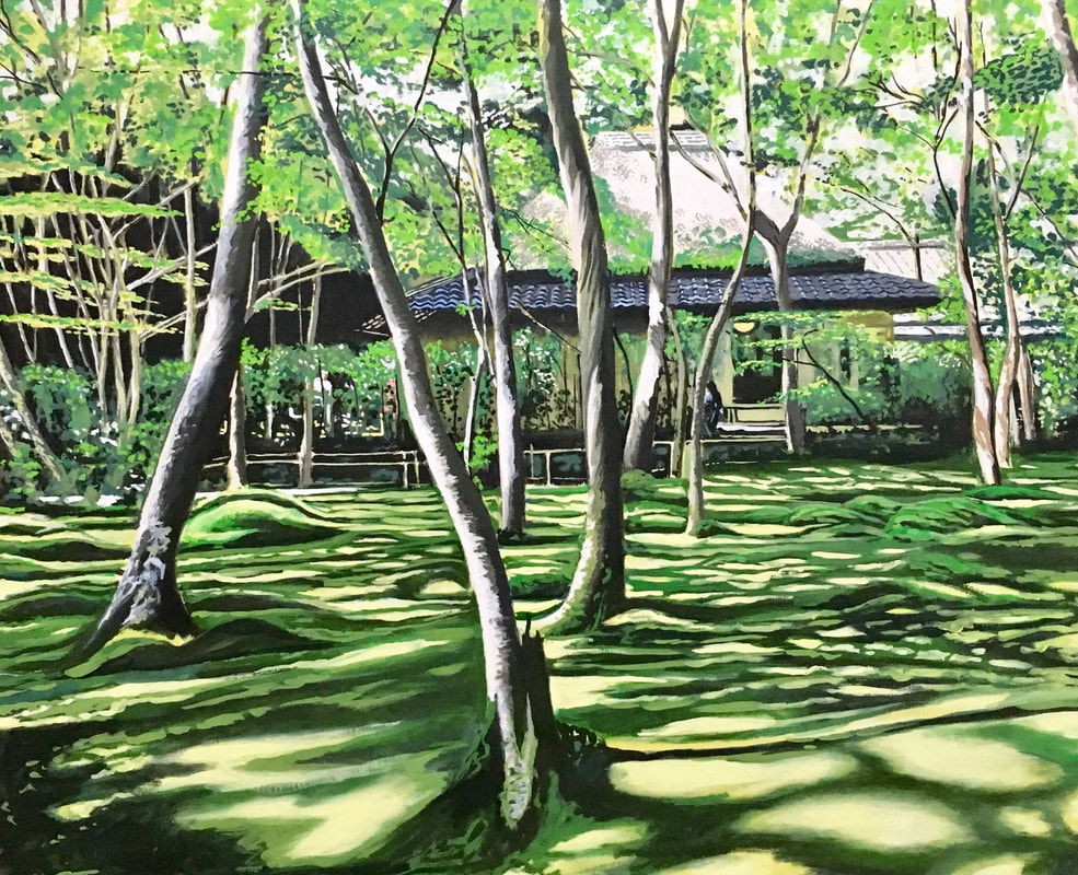 Gio-ji moss temple, Kyoto 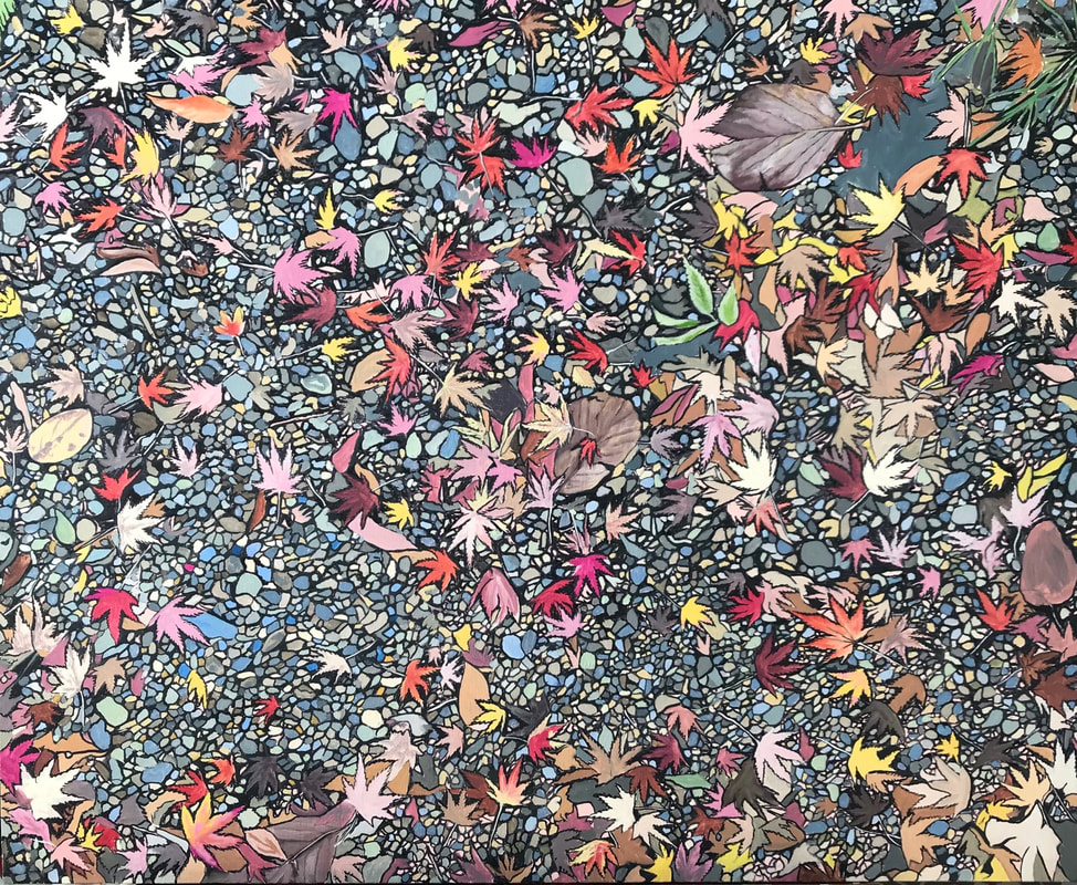 Autumn leaves And a new suite of cityscapes. This first one was an experiment to see if I could translate an iphone panoramic photograph to canvas. What do you think? 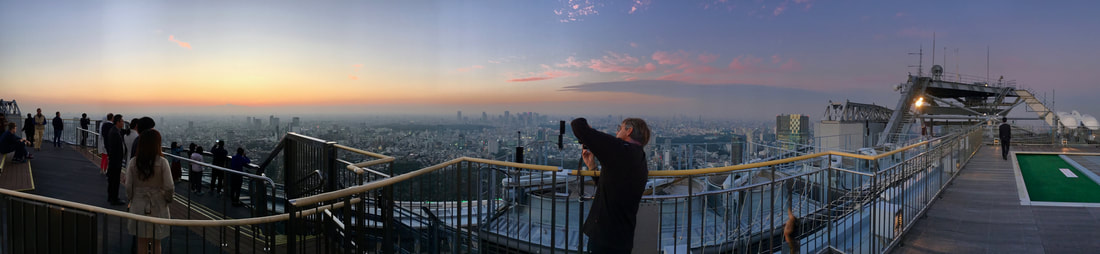 Panoramic sunset shot - Roppongi Hills Skydeck 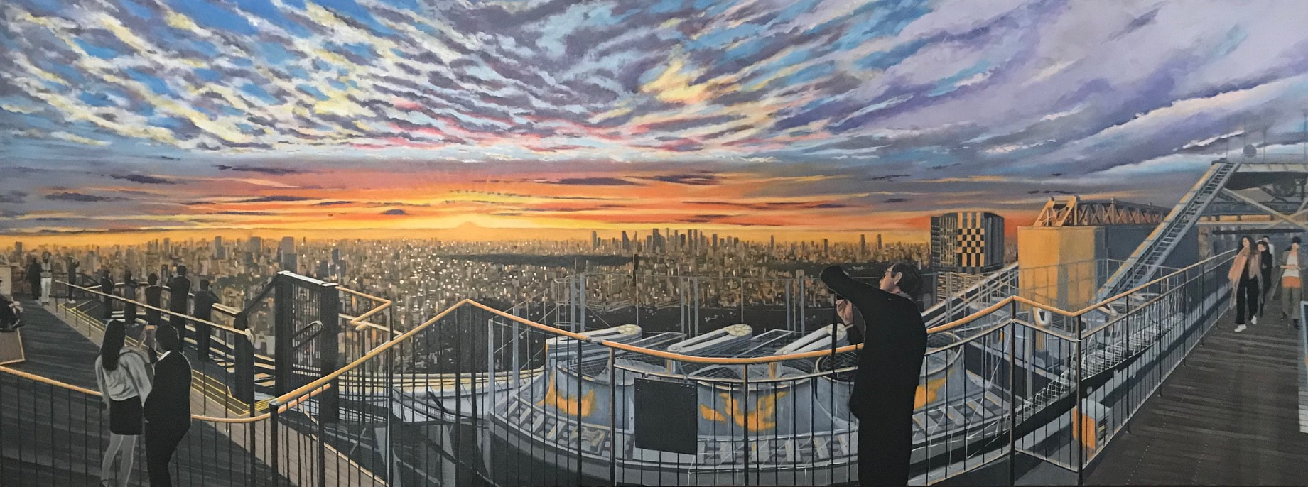 Panorama 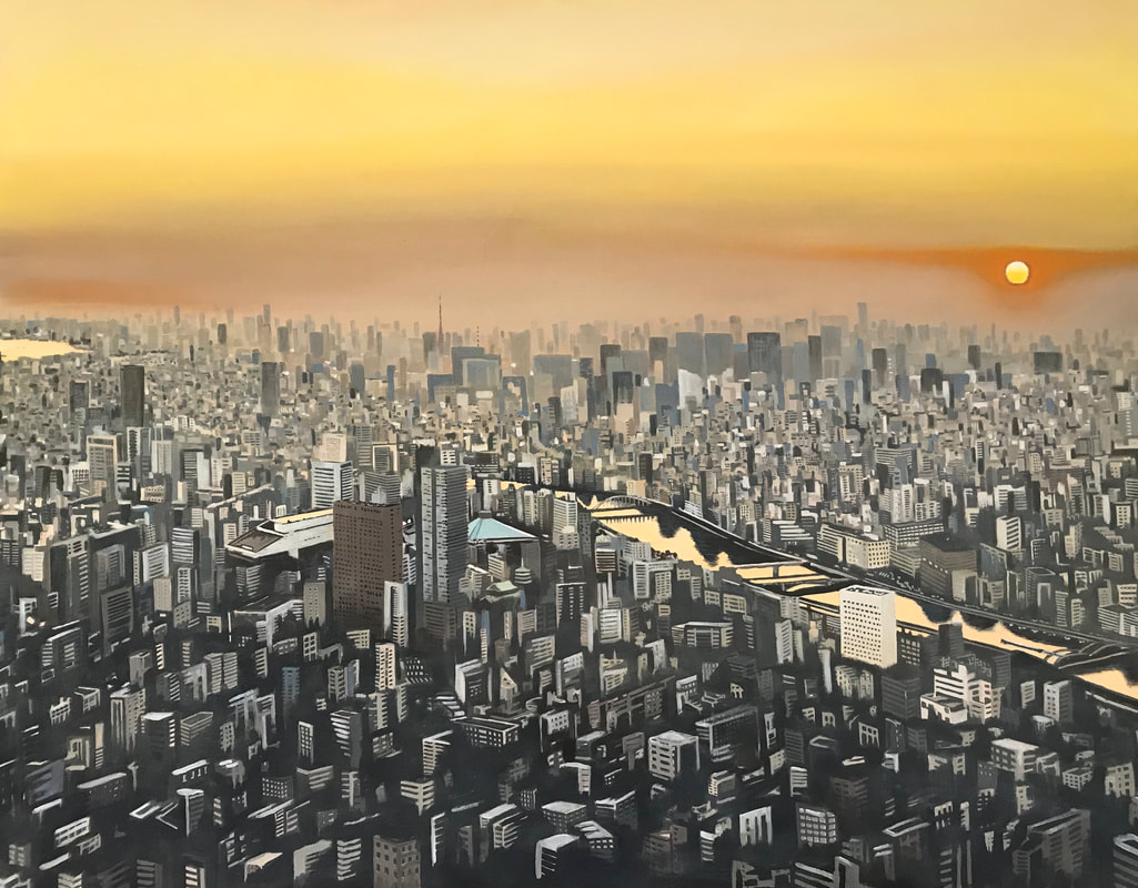 Skytree sunset
Then some random Japan scenes.... 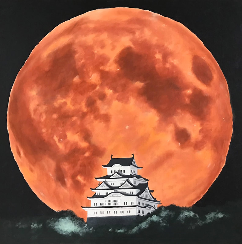 Blood moon, white castle 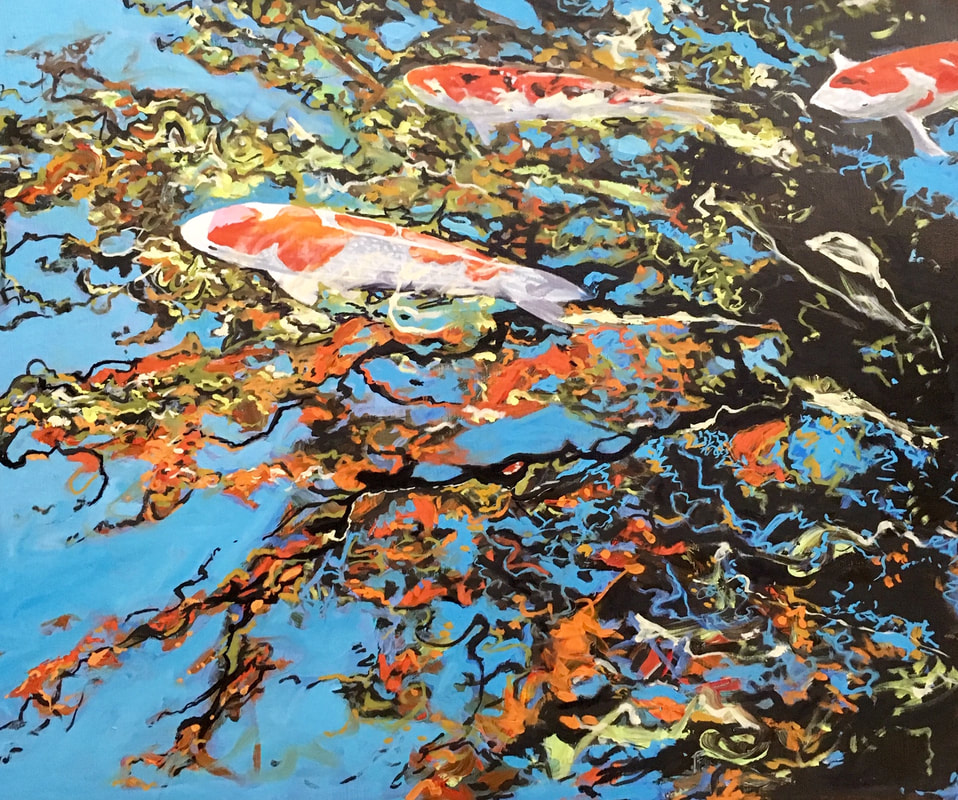 Happo-en Koi, Autumnal leaves reflection Finally, some work in progress.....
1 Comment
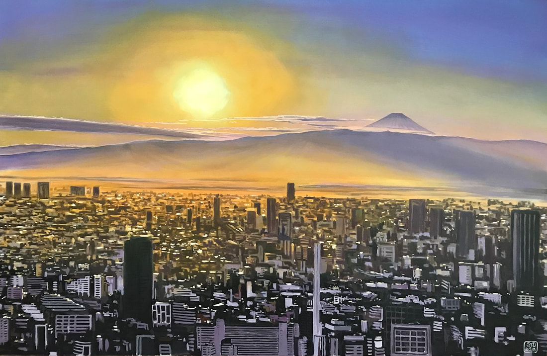
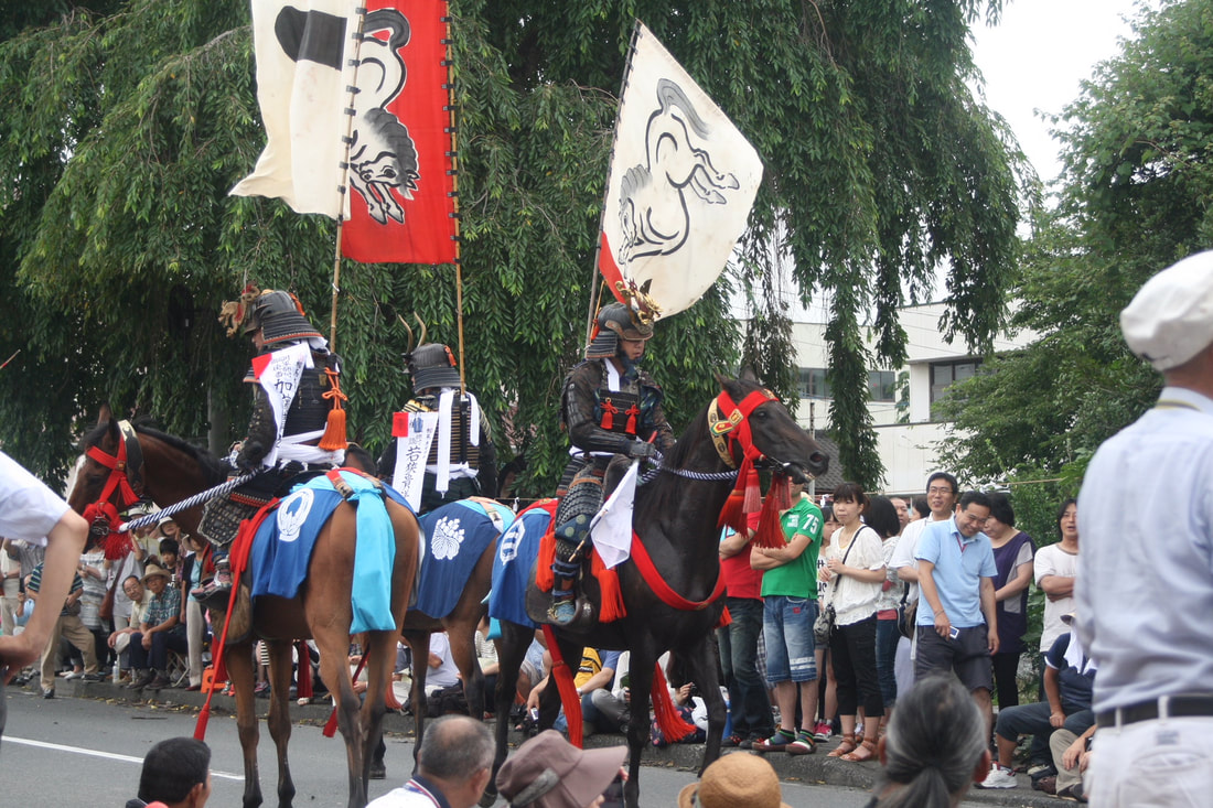
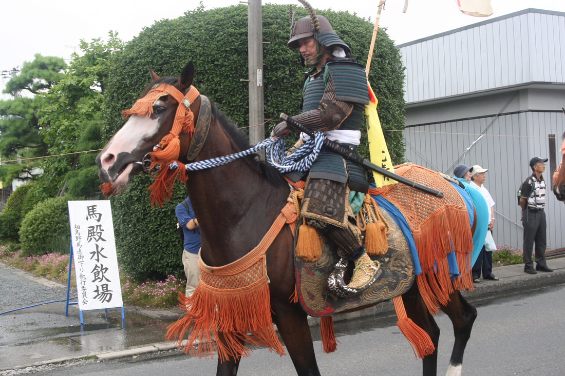
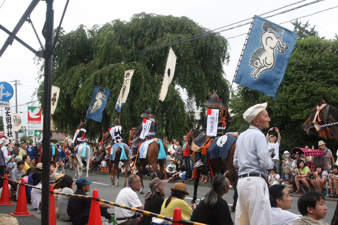
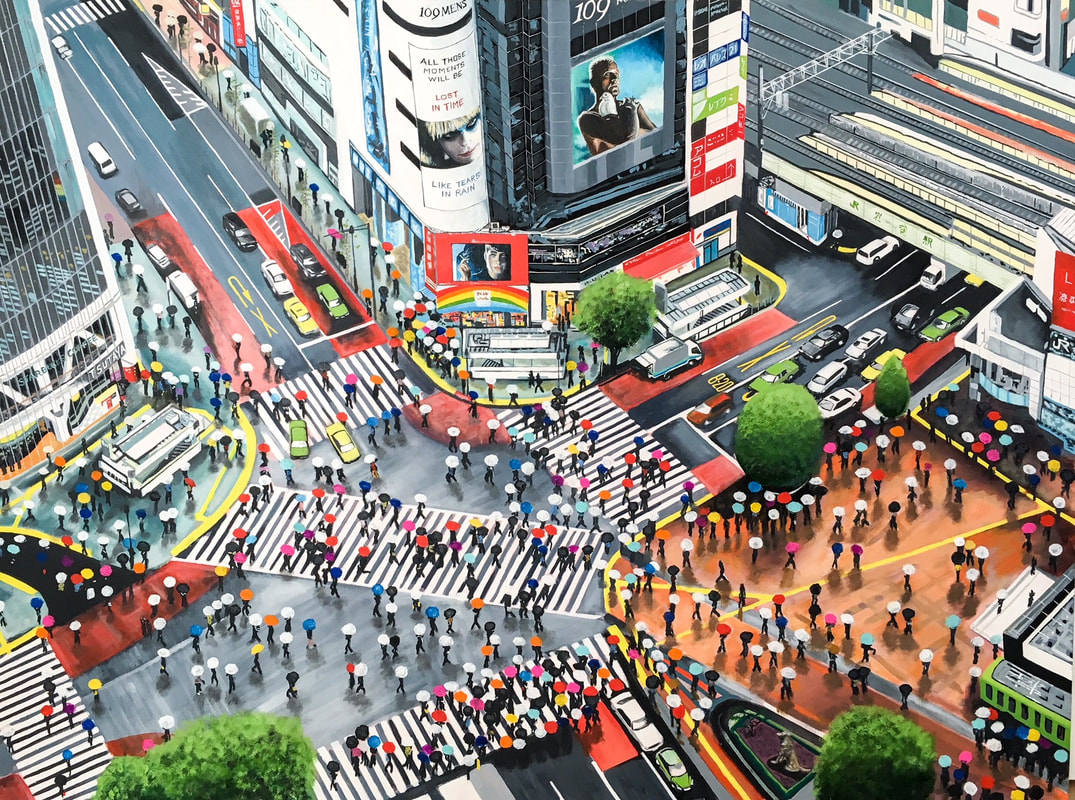 "All these moments..." Oil on canvas, 98 x 130 cms Large Tokyo cityscapes continue to take up much of my studio time. I have been meaning to do one of Shibuya`s Hachiko crossing for a while but never found the right angle or composition. I finally worked out an interesting perspective looking down from above on a rainy scene. I was trying to capture the manic scramble, colour and hustle that is Hachiko on a late Sunday afternoon. The digital advertising screens are an integral part of the experience and I inserted characters from the original Bladerunner movie to spice things up further. Can you spot the doggy statue? 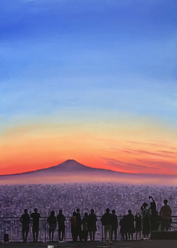 Roppongi Skyview sunset. Oil on canvas, 53 x 74 cms Don`t you love those clear crisp bright Tokyo winter days? I spend more time than I would care to admit up on Roppongi Hills` Skyview terrace searching for the perfect source photograph. The one above was based on different shots I`d taken at the end of November. I`d like to do a large canvas using the i-phone panoramic function so have been trying to get the right shot. The one below is the nearest yet but still isn`t quite right. A new large (220 x 80 cms) canvas custom-made by the wonderful Sekaido people arrives next week so more visits to the 53rd floor will be required! 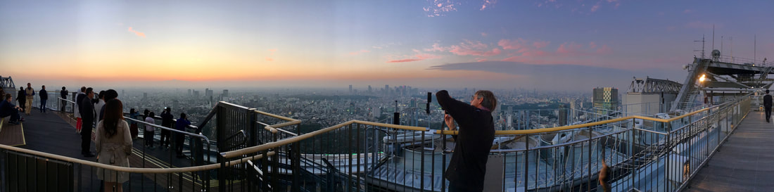 Panoramic source image. Roppongi Hills Skyview terrace. This painting of Nijubashi Bridge was based on a shot taken one early April morning when the sky was clear, the air sharp and the trees bursting with the sap of Spring. The reflection in the water of the moat caught my eye and I have tried to capture the majestic isolation of the Imperial Palace. 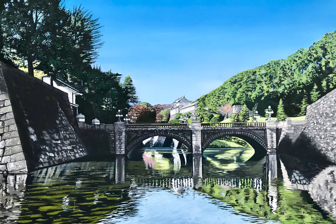 Nijubashi bridge. Oil on canvas. 63 x 92 cms Finally, a year after the 2011 earthquake we visited Minamisoma in Fukushima Prefecture for the famous Soma Nomaoi festival where riders in medieval samurai armour battle it out for honours in thrilling races. Through the peerless connections of our good friend Melanie Brock we had a grandstand view of the riders as they paraded down the street en route to the racetrack, and I took a load of photographs.
The colourful pageantry combined with a sense of history and the general good humour of the occasion combined with the excitement of raceday made it a special occasion. Its taken me over 5 years to commemorate it in artistic terms. Some of the participants had wonderfully craggy features and these three characters below - I hope you agree - have made interesting paintings! 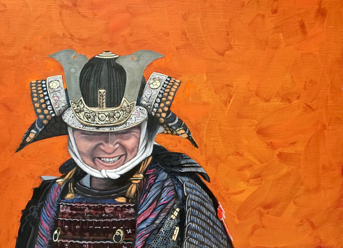 Smiling Samurai. Oil on canvas. 33x 45 cms. 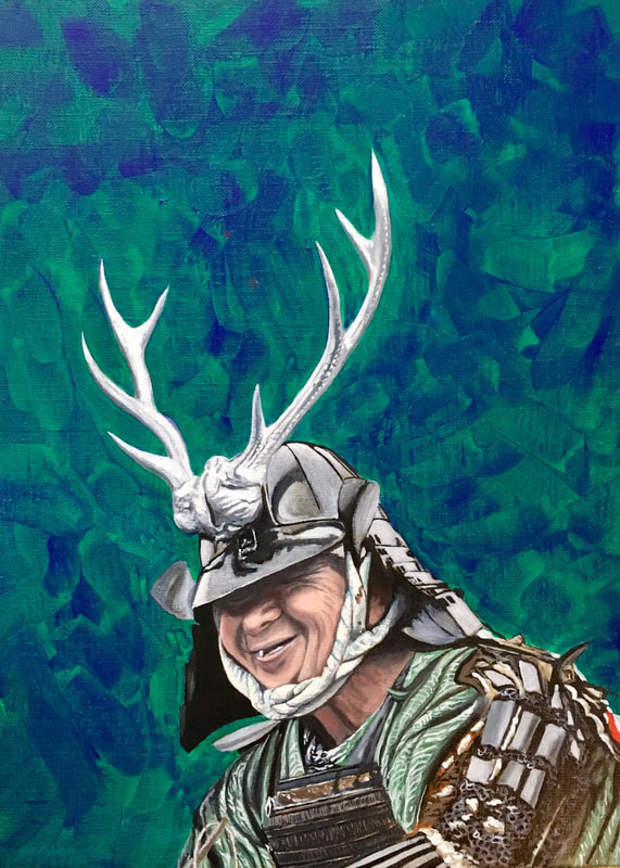 Toothless wonder. Oil on canvas. 33 x 46 cms. 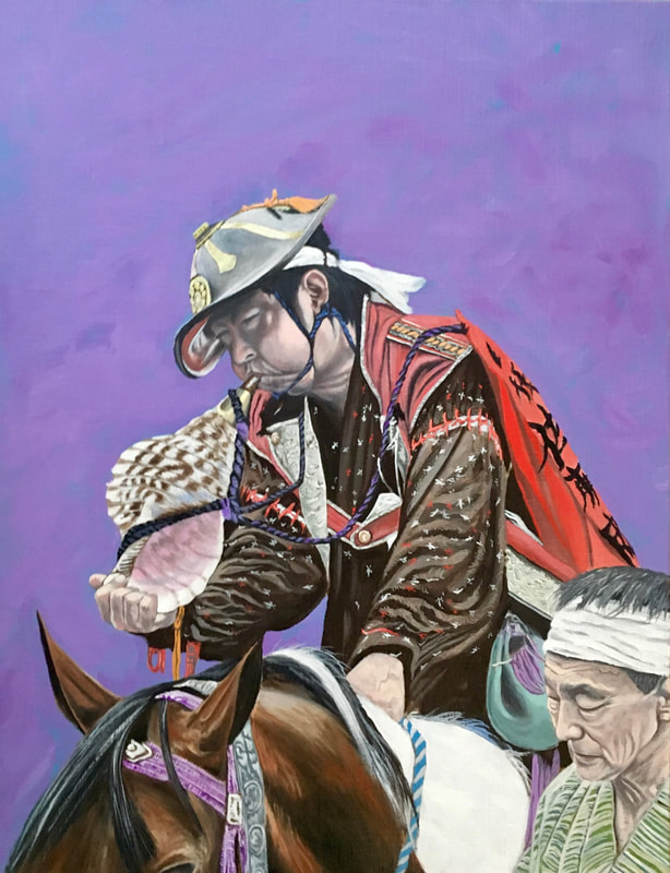 Blow. Oil on canvas. 41 x 54 cms. That it for now. I hope you like the artwork. Contact me on [email protected] if you are interested in commissioning a painting or purchasing a limited edition print.
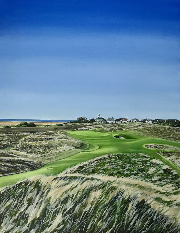
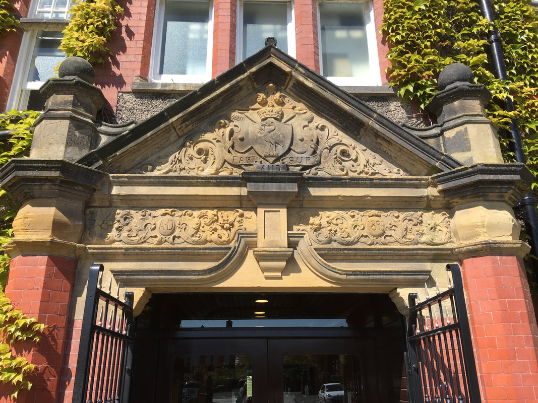 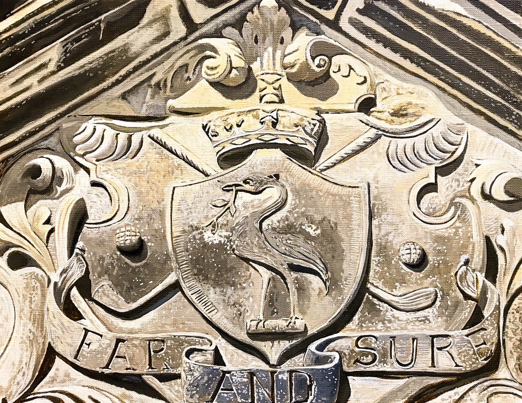 "Far and Sure". Oil on canvas. Walking out of the clubhouse of Royal Liverpool Golf Club one morning in late April I happened to look round just as the sun burst through the clouds and lit upon the stone lintel above the front door. I had never noticed the beautiful stonework before depicting our club's emblem the Liver bird, and in that brief moment it glowed. I took a photo on my i-phone and ten days later I completed a small oil painting, named after the club motto "Far and Sure".
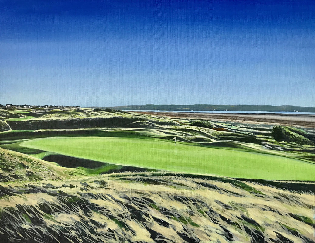
The so-called "Red Room" paintings have been very popular with a set of limited edition prints sold out last year and now, two new commissions for original painting versions of the same theme. One is shown below. 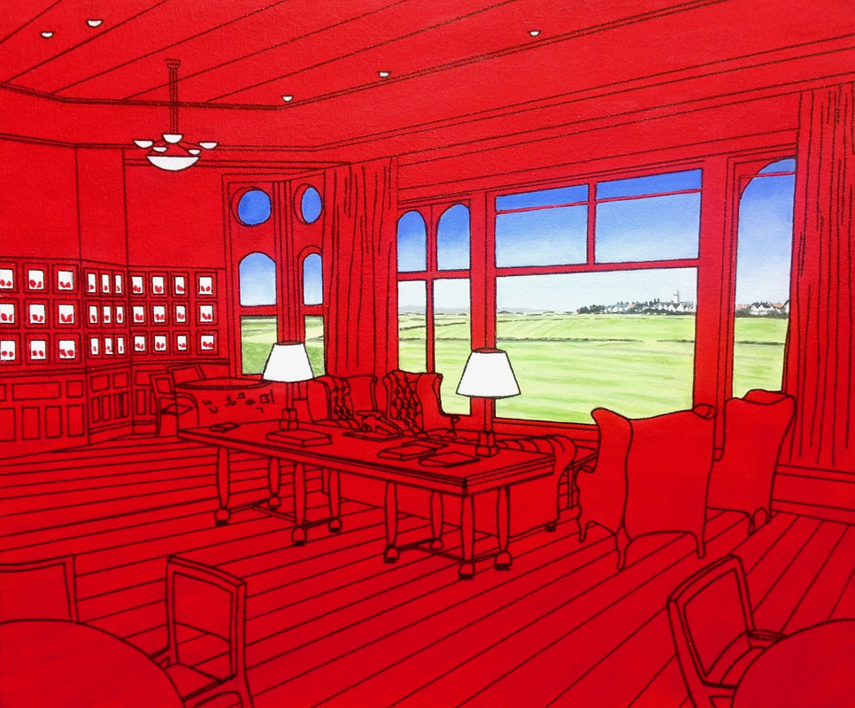 "Red Room". Acrylic on board. This year's Captain Bruce Taylor kindly asked me to provide two paintings as prizes for the Long and Short courses Captain's Prize this year. His request was for a depiction of the short 13th hole, Rushes. A hole of happy memories for Bruce where some years earlier he had shaken hands as he won the Captain's prize. Again, I chose views both from the teeing ground, and from the green looking back.
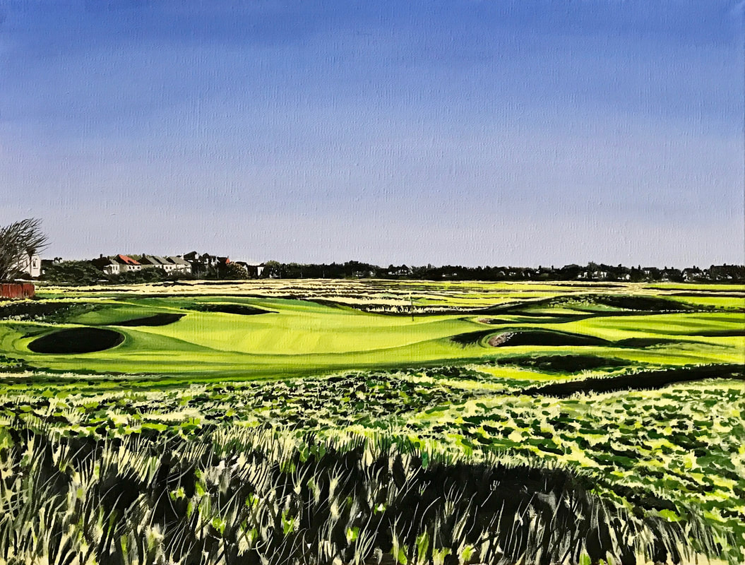
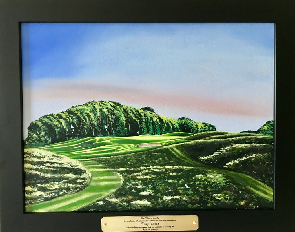
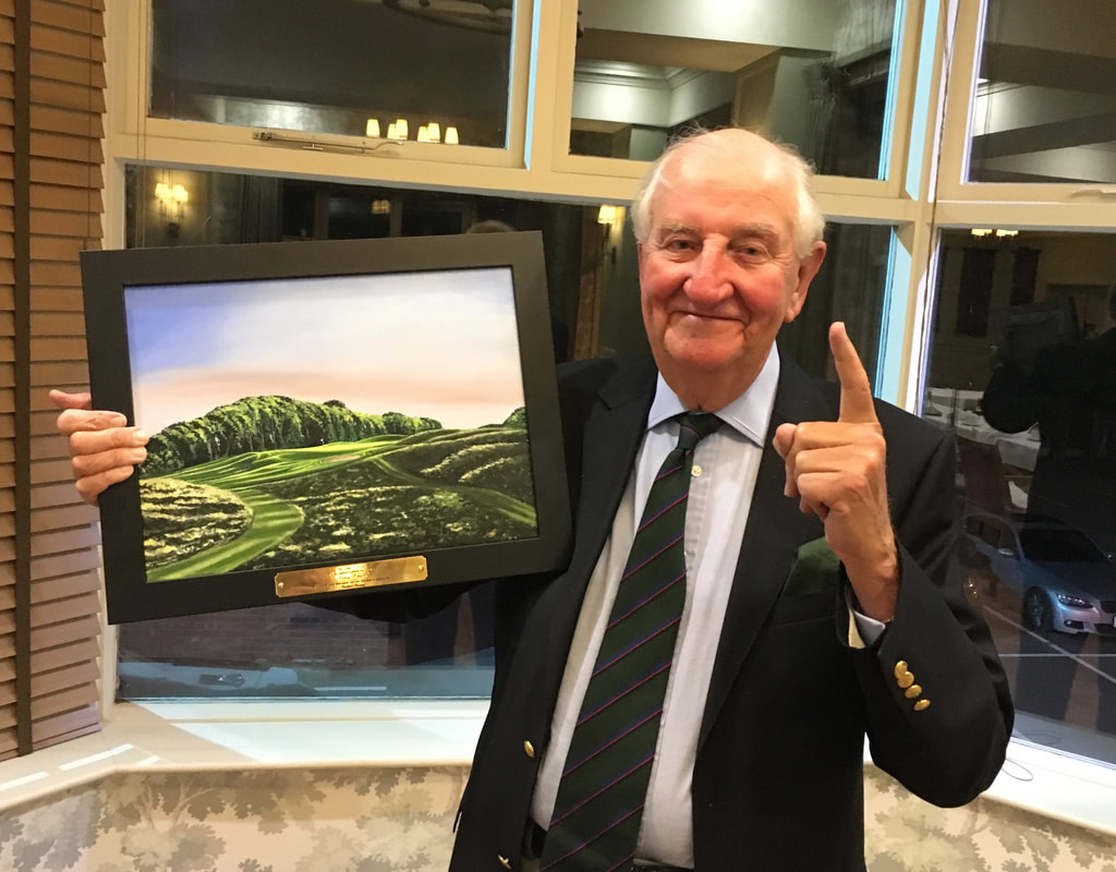
I was delighted to provide a painting of the short 5th hole at Formby as a gift to Tony Ensor presented at the Old Malvernian Golfing Society's Northern Meeting in early September in recognition of his 80th birthday and his superb record in running this meeting for 43 years and counting. What a star.
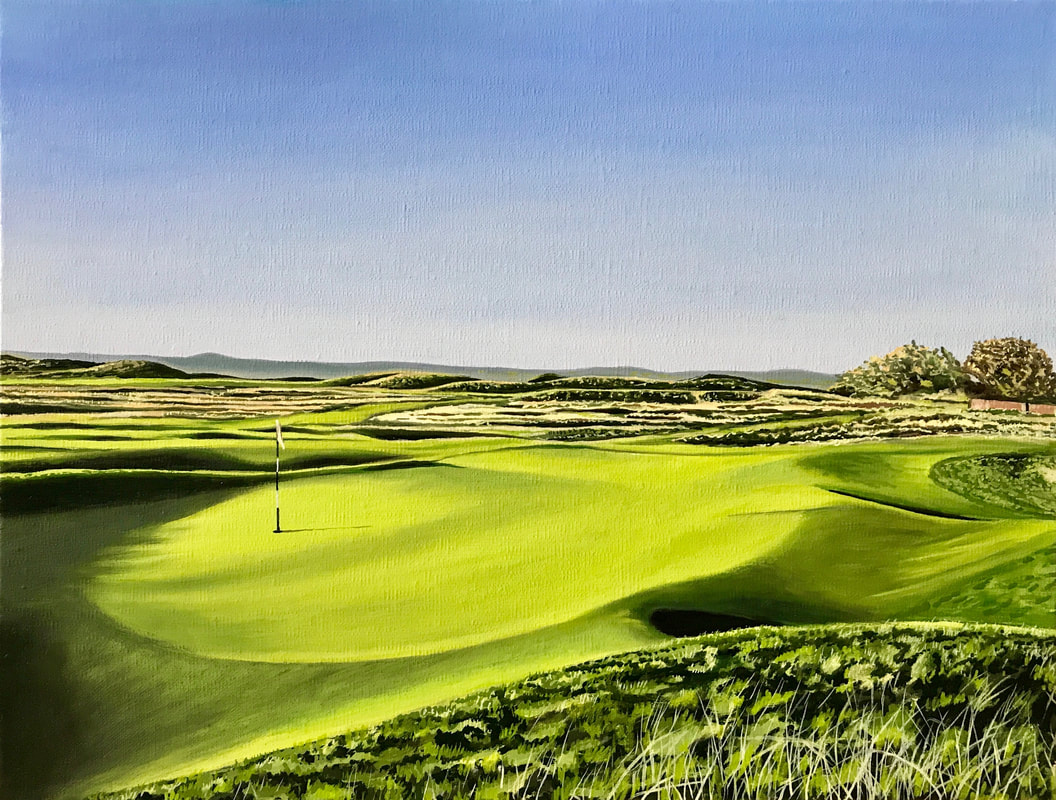
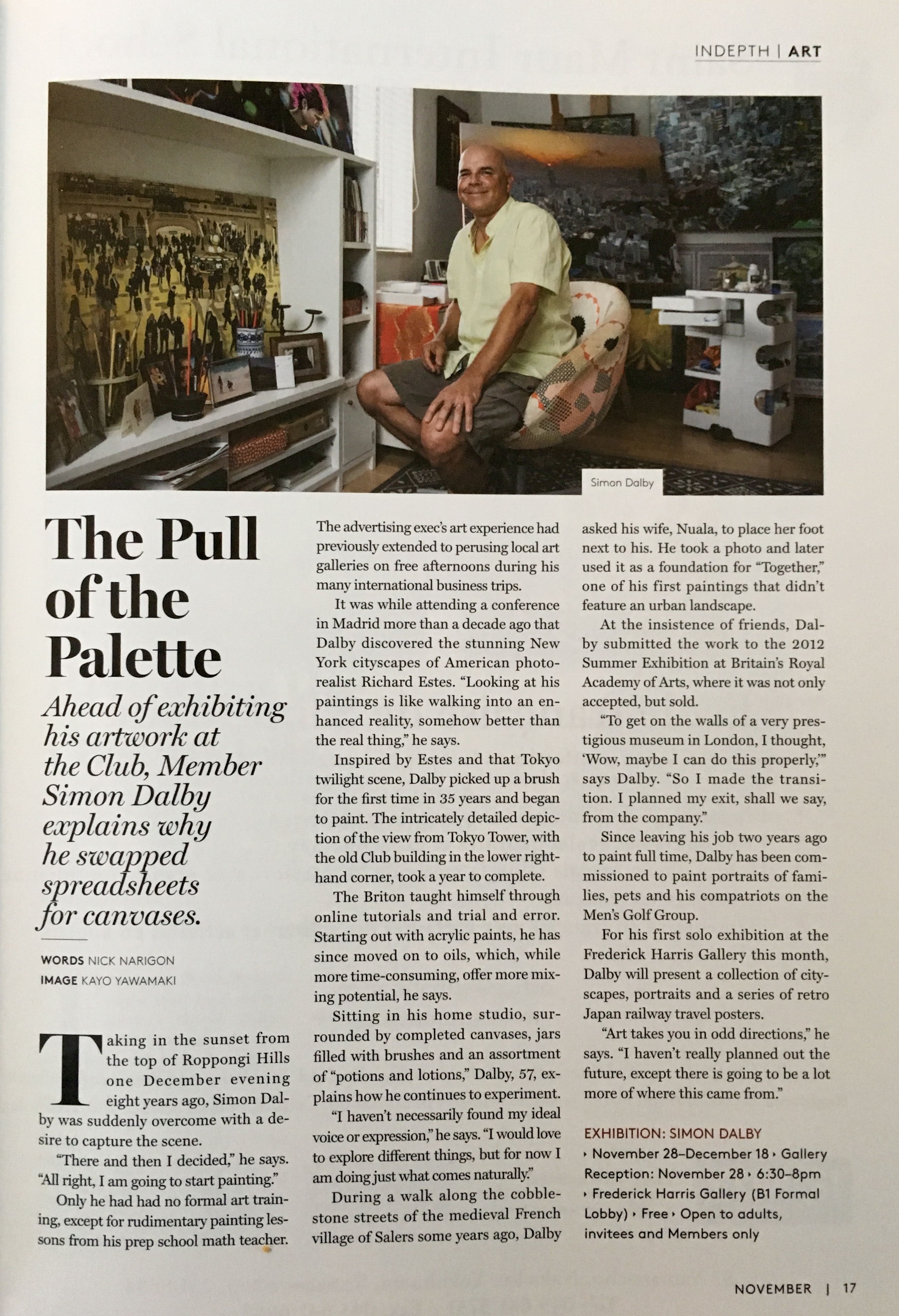
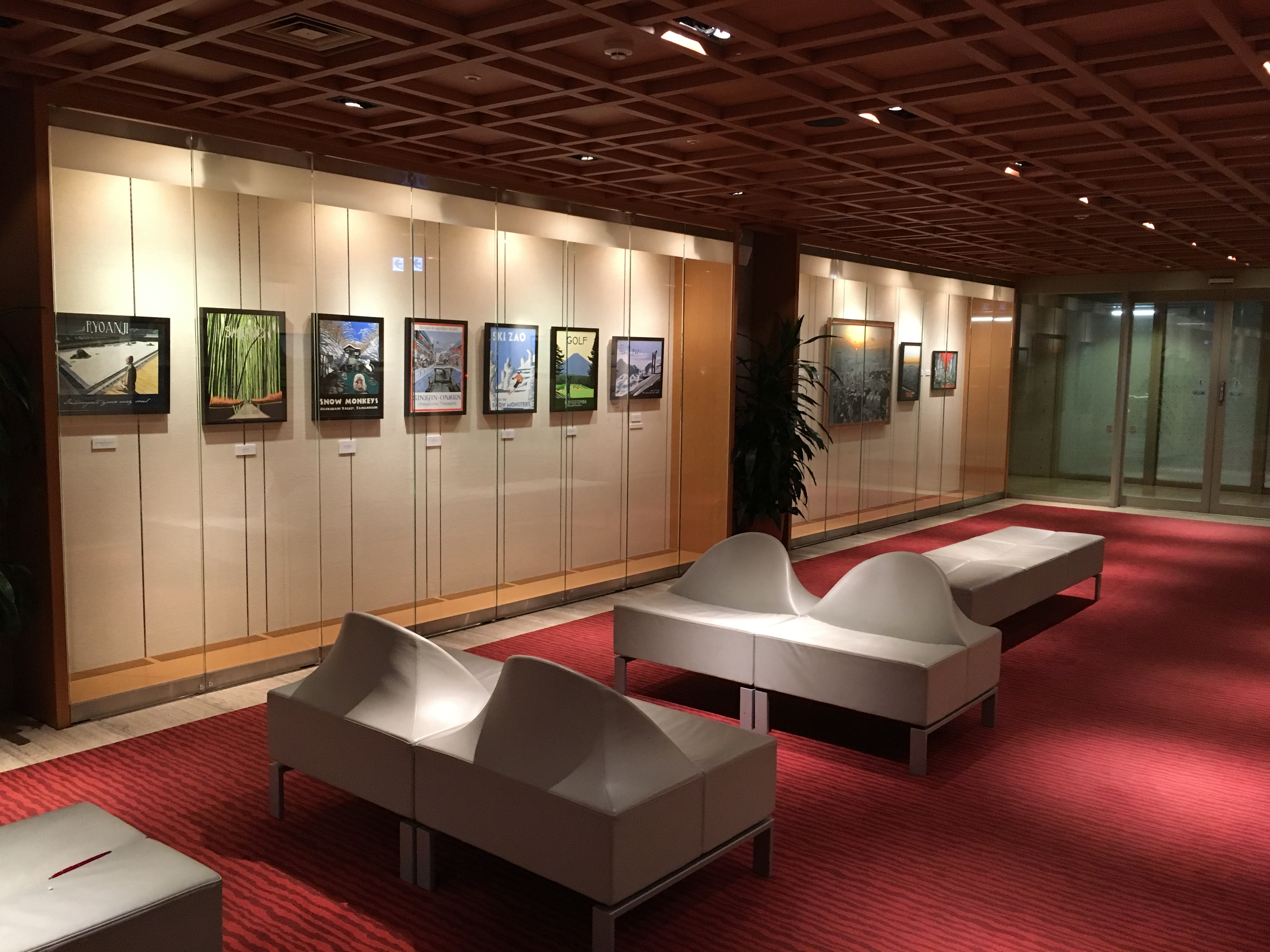
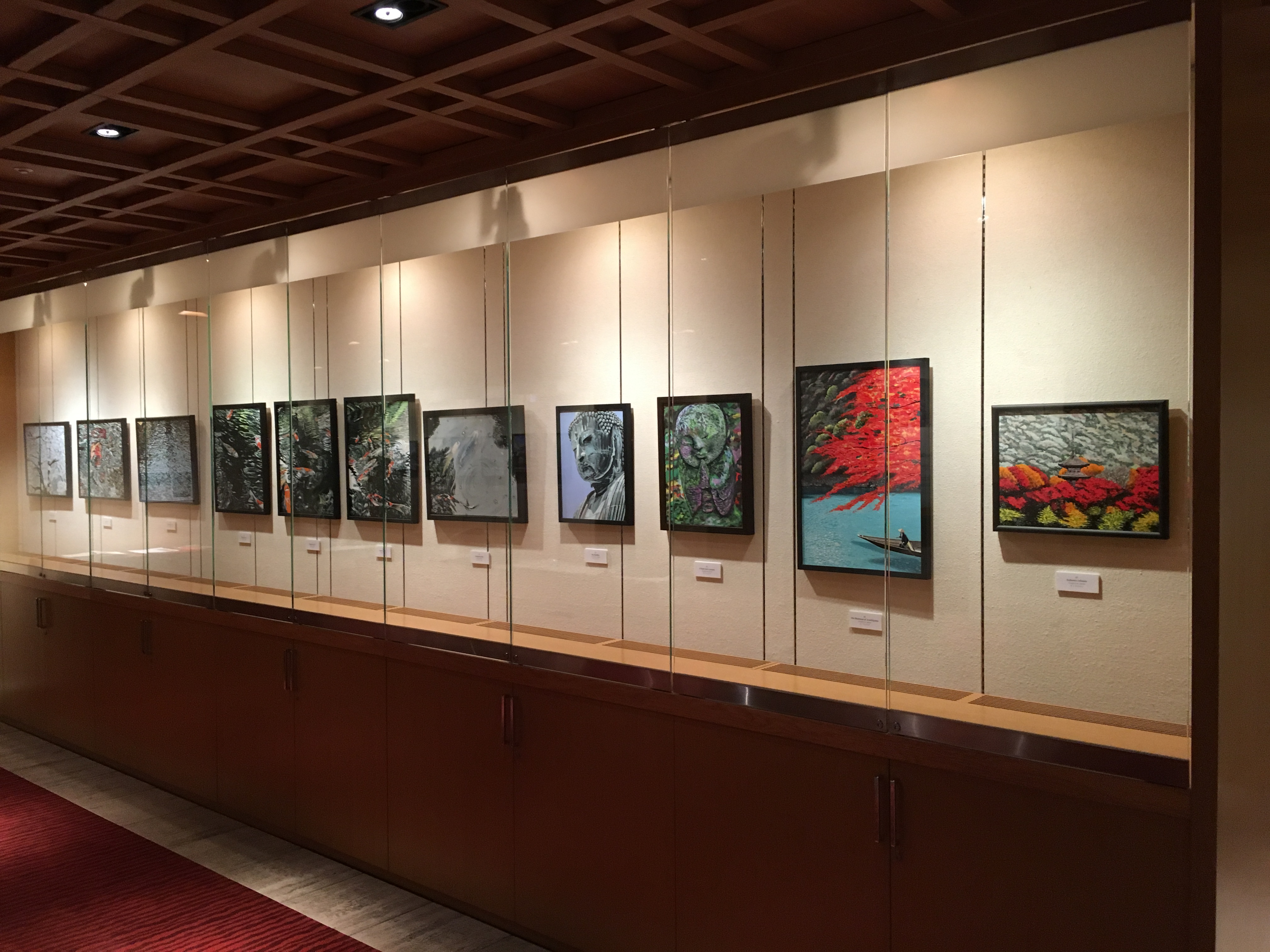
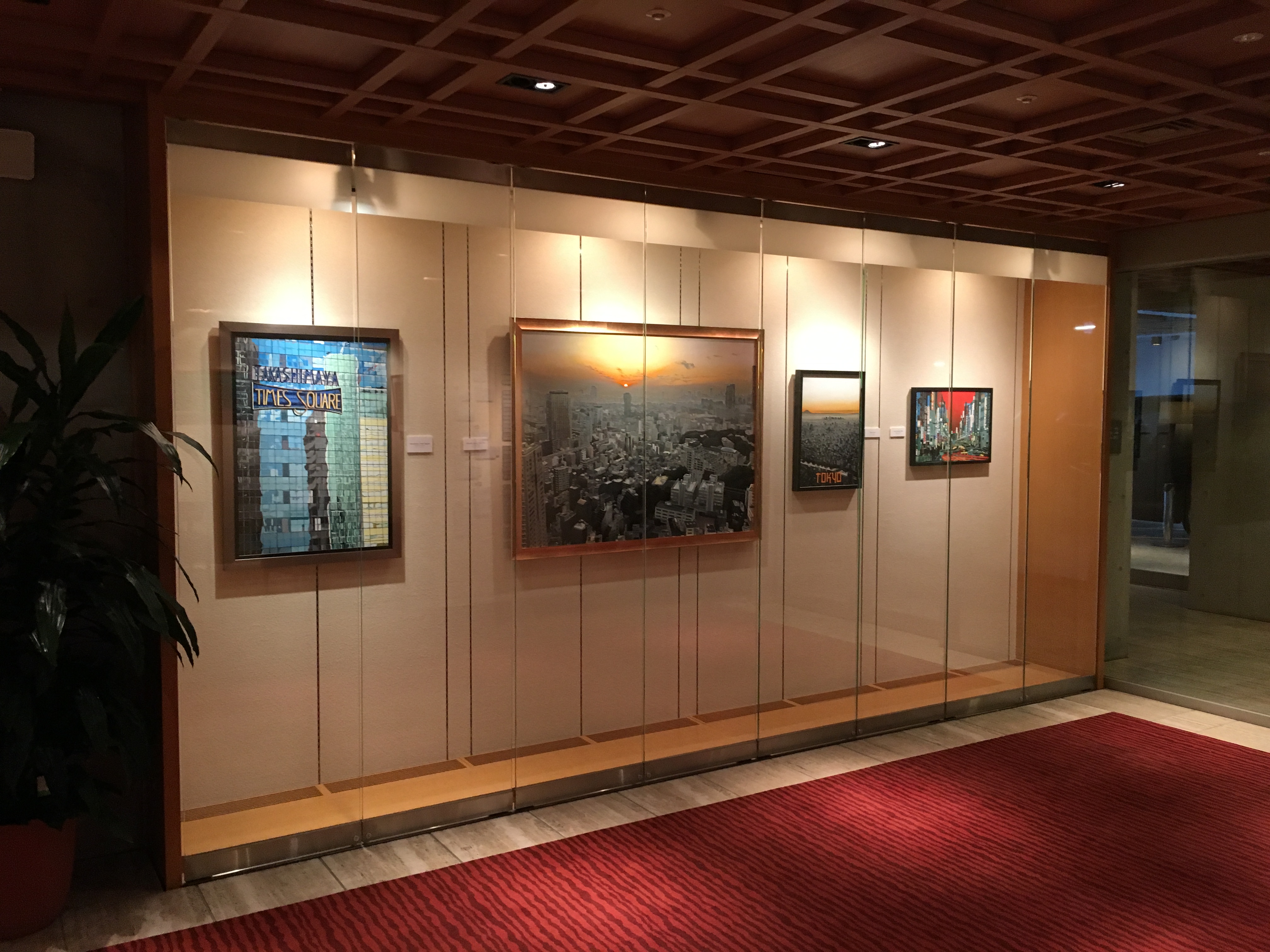
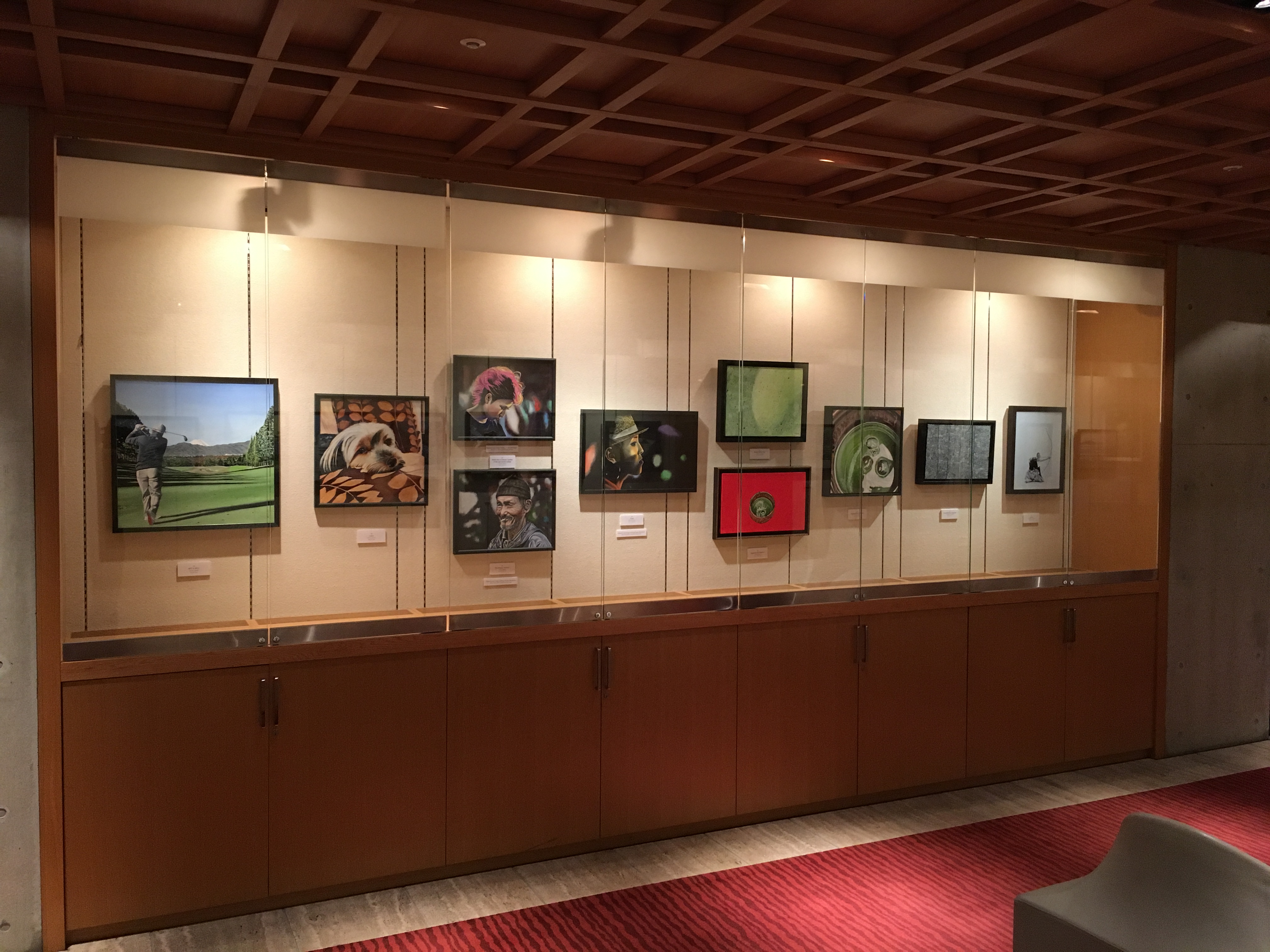
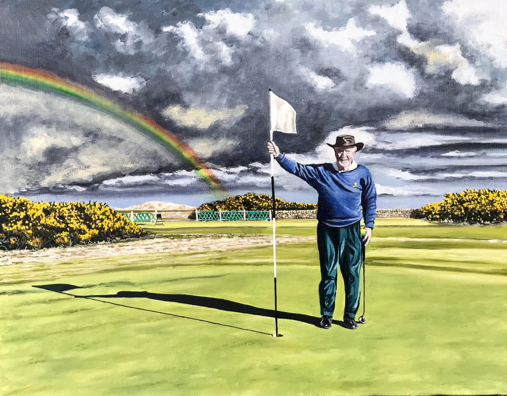 "Rainbow over the Eden" Oil on canvas Finally, getting somewhat bored with traditional golfing compositions I experimented with a completely different approach, more Andy Warhol than Graeme Baxter! Not sure exactly if this study 'worked'...I have had several reactions, mostly agreeing with this scepticism! Let me know what you think, and if you are interested in commissioning an original piece of golf art....whether 'traditional' or 'different'. 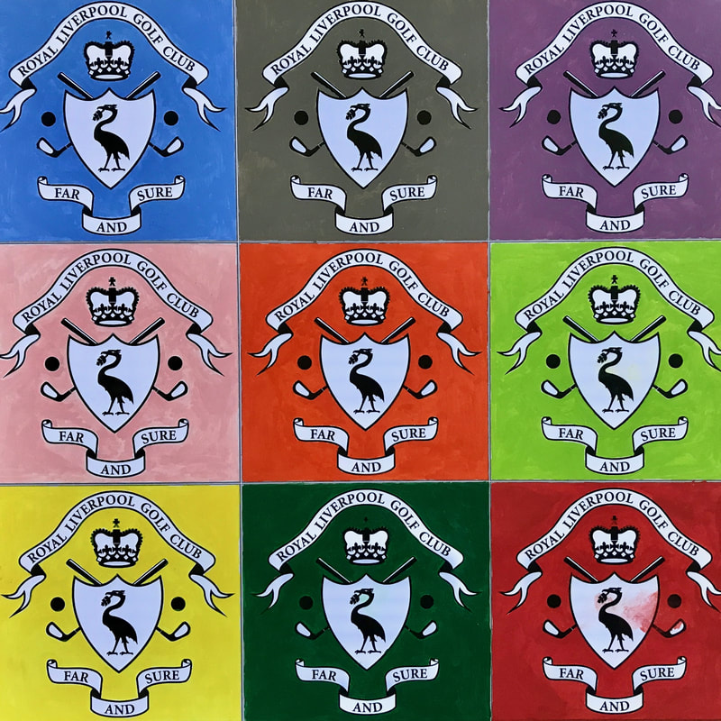 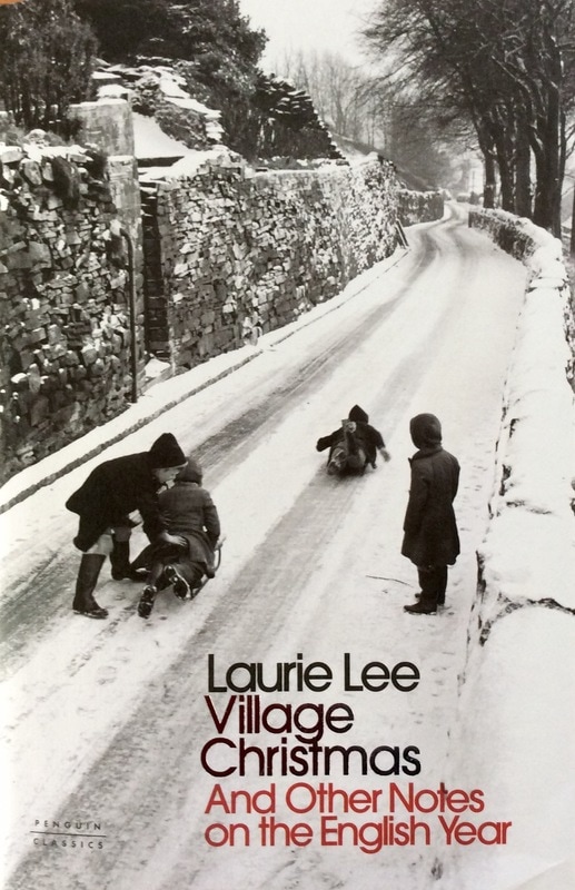 How this slim hardback arrived at my bedside I know not. Laurie Lee is best known for `Cider with Rosie` a book I have never read. But the book appeared, and its cover photograph invited closer inspection. Inside in short `notes` of a few pages each is some of the best writing about the magic of the English seasons seen through the eyes of an unusually perceptive and imaginative writer of English prose. Just read this, entitled `A cold Christmas walk in the country` written from memory of his childhood in a now-vanished Gloucestershire: "Pushing the cold before me like a sheet of tin, I set off up the Christmas road. It is a morning for heroes and exhilarating exile, a time to shock the blood back to life, while I go stamping frost-footed along pathways of iron, over grass that is sharp as wire, past cottages hollowed out like Hallowe`en turnips all seething with lights and steam. I climb up the valley, breathing hard the sharp air which prickles the nostrils and turns to vapour. To be walking today is to be followed everywhere by private auras of pearly cloud. The wandering cows are exhaling too - pale balloons of unheard conversation. The ploughed fields below me have crusts like bread pudding, delicately sugared with twinkling frost. the distant pastures are slivered, crumpled and bare. Even the light they reflect seems frozen." Reading this on a kodachrome February morning in the cool blue winter suntrap that is the flat roof of our Tokyo house I thought of a painting I love to gaze at in Sydney`s Art Gallery of New South Wales, called `Spring Frost` by Elioth Gruner. 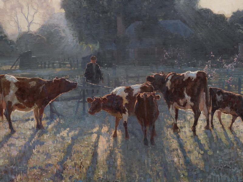 Spring Frost, Eliot Gruner, Art Gallery of New South Wales There is something magical about those frosty white-bright winter mornings in the English countryside when the world seems to stand still and wait in a spell-like silence. Laurie Lee continues: " Where was this valley last summer? It was not here then. Winter and summer are different places. This beech wood, for instance, so empty now, no more than a fissure of cracks in the sky - where is the huge lazy heaving of those June-thick leaves, reeking of sap and the damp roots of orchids, rustling with foxes and screaming with jays and crammed to the clouds with pigeons? The wood, for the moment, is but the scaffold of summer. It stands stripped to the bruising cold. A dark bird or two sit along the bare branches. None of them move. They might be caged". Wonderful stuff. Inspiring. Do you long with a kind of sentimental rose-tinted recollection for the salad days of childhood, messing about outdoors with pals in the winter snow? Sledging for dear life, skidding on frozen ponds, snowball fights and red-nosed glee. If you like this writing, buy the book! www.amazon.co.uk/Village-Christmas-English-Penguin-Classics/dp/024124367X/ref=sr_1_1?srs=1648031031&ie=UTF8&qid=1486865485&sr=8-1&keywords=village+christmas 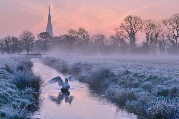 The ethereal magic of an English frosty morning 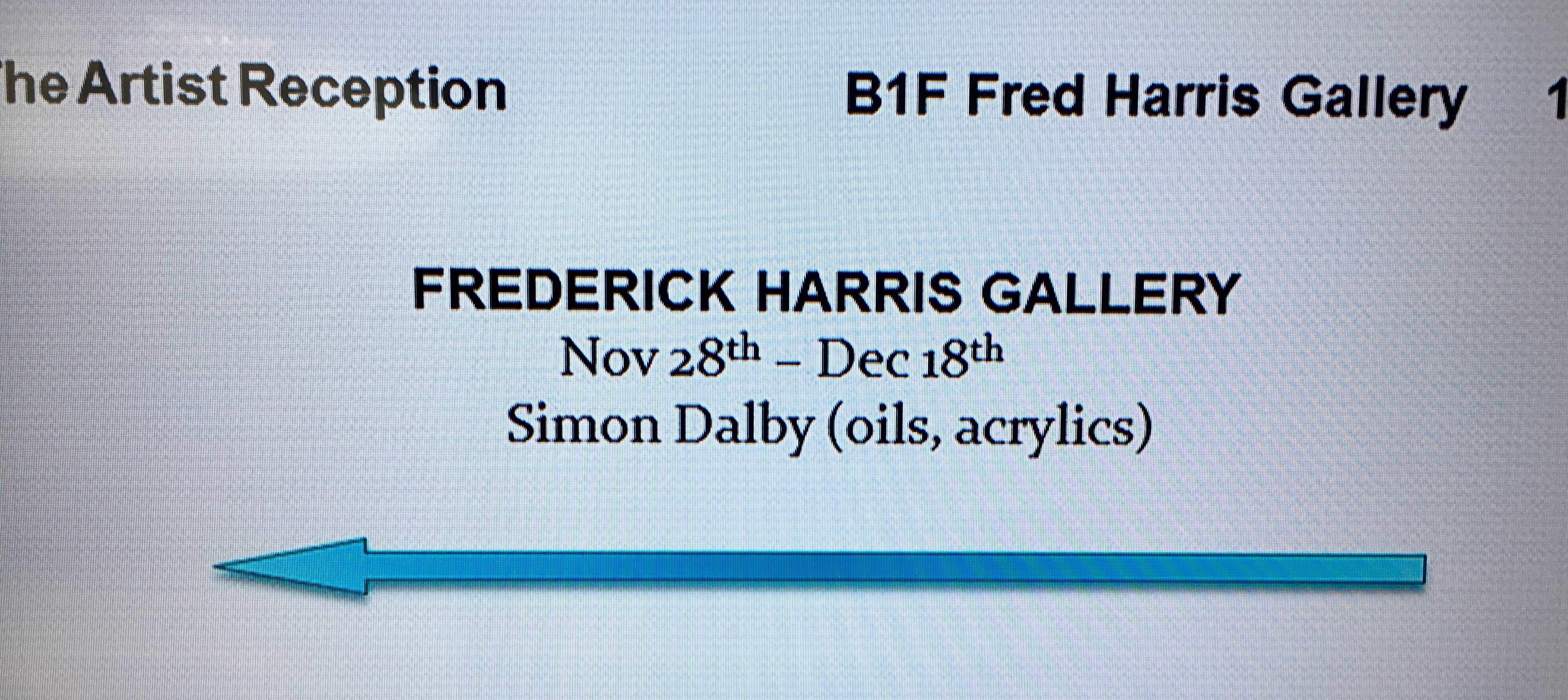 Signage at the Tokyo American Club The Tokyo American Club`s Frederick Harris Gallery showcases the works of local and internationally renowned artists with two shows every month featuring everything from painting to ceramics to calligraphy. www.tokyoamericanclub.org/index.php/en/frederick-harris-gallery So popular has this become that there is now a three year waiting list for applications. I was fortunate to be selected back in 2014 and finally, after a long wait (but giving me plenty of time to work up a portfolio) the show has launched. Displayed in the B1 space are 44 paintings in oils and acrylics featuring scenes of Japan - cityscapes, travel posters, landscapes, portraits and still life.
The opening reception was well attended with almost 50 guests from Japan and overseas and the paintings have been universally praised. Even better, after only three days nearly a third of them have been sold! I am thrilled at the response and grateful to the people that have supported me and made this all possible: the Frederick Harris Gallery committee, the friends that rallied round to carry paintings, man the reception desk, send flowers and gifts, and of course my gorgeous wife Nuala who has encouraged me on this new journey every inch of the way. I hope you will be able to get to see the exhibition before it closes on December 18th. Non-members of TAC can visit the B1 gallery during office hours so don`t worry if you are not a member! [email protected] 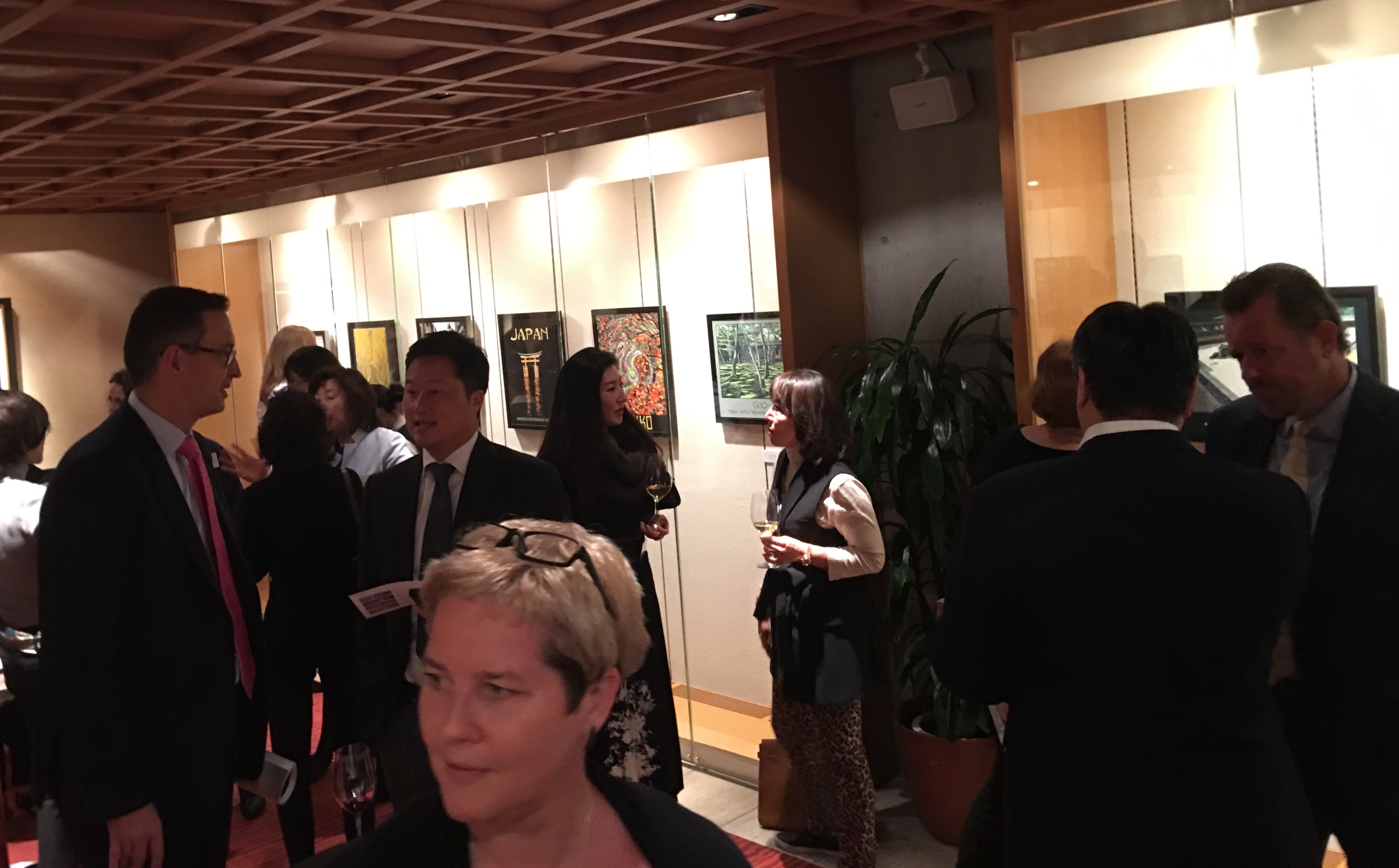 Opening reception 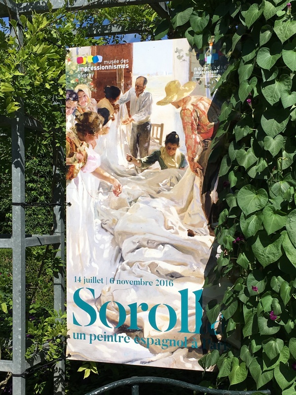 Have you ever come across the Spanish painter Joaquin Sorolla? I must confess I had never heard of him until I visited Giverny and stumbled across this marvellous exhibition at the Musee des Impressionismes. In 1906 an exhibition of his work at the Galerie Georges Petit in Paris containing no less than 500 of his paintings - critics and the art-loving public alike were astounded at his prodigious output - launched him on the global art stage. This exhibition shows a broad cross section of his work from Paris with some 50 paintings plus preparatory sketches and studies. 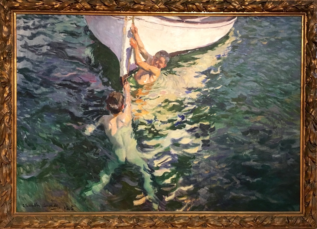 Swimmers, Javea, 1905 Sorolla's rendering of light tends to class him as an impressionist painter. And the way he can conjure the play of sunlight on water does remind you of Monet. But his work encompasses so much more. The virtuoso spontaneity of his brushwork is right up there with Sargent. His portraiture brings to mind Velasquez (whose paintings in the Prado he scrupulously copied as a student). But standing in front of his vast canvases you realise that his style is rather unique. What seems to set them apart is a wonderful freedom of composition and movement combined with an uncanny handling of the effects of light and a boldness with colour. This is most apparent in his paintings of children in the seawater around his home town of Valencia in Spain. 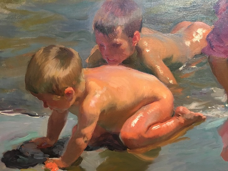 Children on the seashore (detail), 1903 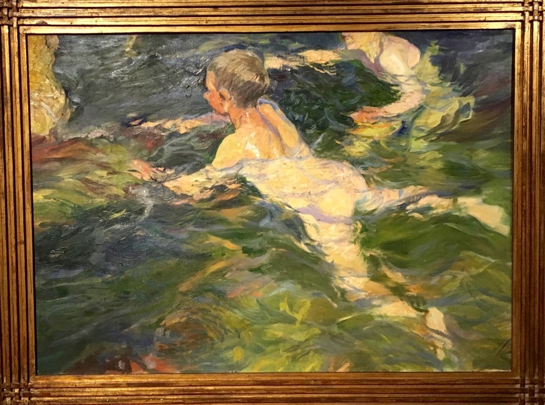 Swimmers, Java, 1905 Sorolla painted at great speed, often en plein air, with little advance planning of the composition. He would start with one image and the canvas then developed almost of its own accord. His paintings are thus a race against time, a race to capture the rapidly changing light effects of sunlight, shadow and colour on a summer's day. Look at these canvases up close and there is a whirlwind of dramatic brushwork using bright primary colours, olive greens, mauves, all of the cadmiums. Take a few steps back and the overall effect is startling in its intensity and verisimilitude. Bravura luminosity! Some of his larger paintings - one or two of which are displayed in the exhibition - measure over 3 metres square. For these studio-based pieces he apparently used a palette the size of a grand piano lid, with brushes 3 foot long to allow him to stand just the right distance away to judge the effect of the paint. The large painting below is simply mesmerising, even with poor quality of my photograph. Look up close: the cloth that is being mended is a few daubs of flake white against an indigo grey. Walk back and it miraculously transforms into a riotous bundle of pure sail. Quite something. Check this guy out online. He is very inspiring. 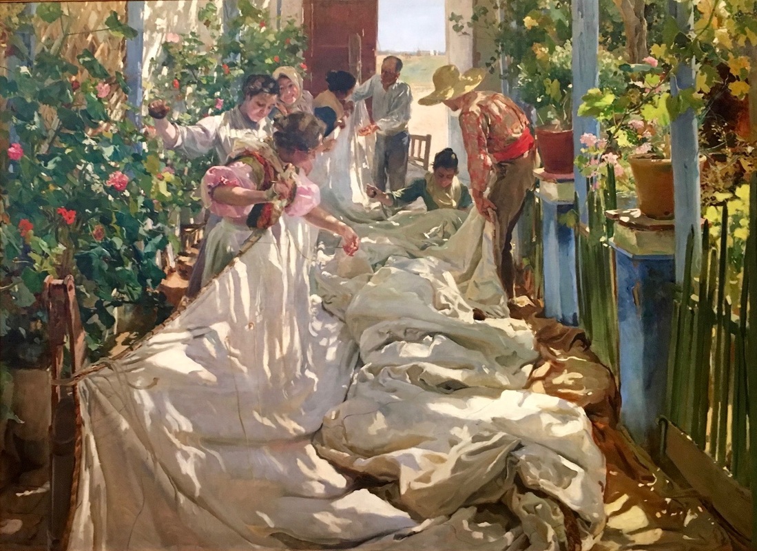 Sewing the sail, 1896 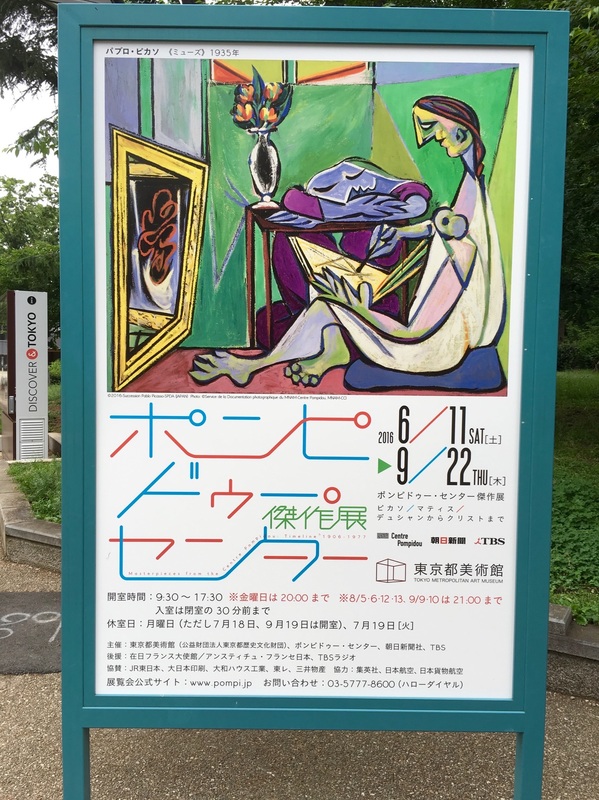 `La Muse` by Picasso features in the promotional poster In the summer of 1977 before going up to Cambridge I hitch-hiked around Europe with a pal from school. A compulsory stop-off point was Paris and I remember doing all the things that arty students would do in those days: wandering through Pere Lachaise cemetery to look at Jim Morrison`s grave, eking out a rudimentary dinner in a seedy Montmartre bistro, admiring the mime artists performing in front of the Centre Pompidou. This seminal piece of modernist architecture had just been opened and whilst many derided its exposed skeleton of brightly coloured tubes we thought it was the quintessence of Cool. During that visit I don`t think we actually visited the Musee National d`Art Moderne which had been moved there. So it was with a feeling of mingled anticipation and sentimentality for a distant youth that I visited The Tokyo Metropolitan Art Museum`s new exhibition "Masterpieces from the Centre Pompidou: Timeline 1906-1977" www.tobikan.jp/en/exhibition/h28_pompidou.html 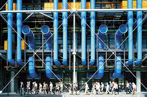 Centre Pompidou: `quintessence of cool` for an 18 year old This innovative exhibition brilliantly combines works from the more established names of 20th Century Art - Picasso, Matisse, Bonnard, Braque, Chagall, Giacometti - with carefully curated works from lesser known figures in art, sculpture, photography and film, such as Jean Pougny, Maurice de Vlaminck, Robert Delaunay. This period included a veritable cascade of different `isms` in painting genres - fauvism, cubism, surrealism, expressionism, photorealism, etc but the power of this show is its diversity and inclusivity, with no one genre dominating. The show spans a seventy-one year period encompassing two World Wars. Beginning in 1906, it follows a simple year by year chronology with each year featuring an artist (with accompanying picture and quotation) alongside one of their works from that year. There are of course some marvellous famous works such as Matisse`s `Red Room` and Picasso`s `La Muse`. But equally absorbing are pieces from artists you perhaps have never heard of before. By featuring them alongside their more famous cousins and embedding them in this sweeping historical overview they take on a resonance and power all of their own. And in case you are pining for the atmosphere of the streets of Paris, there is Edith Piaf (1946) singing `La Vie en Rose` and Henri Cartier-Bresson`s gelatin print of `Behind the Gare Saint Lazaire` (1958).  Otto Freundlich `Mein Roter Himmel` 1933 There are some enthralling works. Otto Freundlich`s `My Red Heaven` above - Freundlich was a German painter and political activist of Jewish origin. He spent time in Paris alongside Picasso and Braque and was featured in the infamous Nazi `Degenerate Art` exhibition after which most of the works were destroyed. In and out of captivity in occupied France he was eventually denounced and deported to Madjanek Concentration Camp where he was summarily murdered upon arrival.  Seraphine Louis `Tree of Paradise` 1929 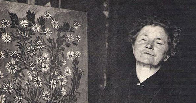 Seraphine Louis "I paint but its terribly difficult, I am old and a beginner that does not know much" Then there there are the vibrant colours of Seraphine Louis, a French worker of the humblest of origins who painted mostly in secret by candlelight and was only `discovered` late in life. `Tree of paradise` has the same emotional intensity and primitivism as aboriginal paintings. 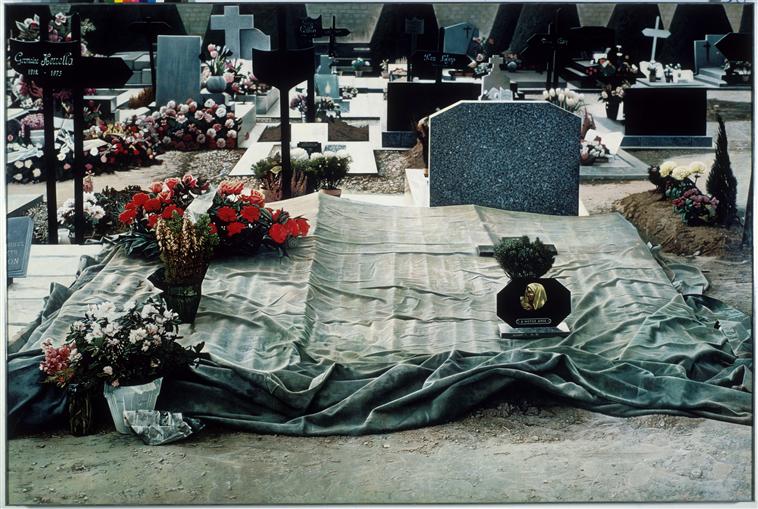 One of Hucleux`s Cemetery paintings - 1974 This cemetery looks like a photograph, but it is in fact a huge painting, the oil paint applied with uncanny smoothness to achieve an otherworldly sense of place. The artist is someone I had not previously encountered, the hyperrealist Jean Olivier Hucleux. I am a big fan of the photorealist style and aspire to this in some of my own work. The rendering of the shroud-like cover over the grave is exquisitely done and had me spellbound for some time.  Maurice de Vlaminck - River Bank, 1909 I will leave you with this landscape by Maurice de Vlaminck with its Cezanne-like brushwork and brooding intensity. Actually the reason I choose this was I like the quotation that accompanied the piece:
"I simply considered that by giving me the joy of work and freedom, painting let me live the way I intended to". Bravo! NB This exhibition has only just opened and will be showing until September 22nd in the Tokyo Metropolitan Art Museum which is based in Ueno Park in the centre of Tokyo. 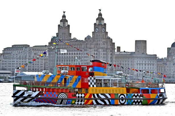 `Everybody Razzle Dazzle` by Sir Peter Blake 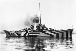 `Dazzle` camouflage on a WW1 ship `Dazzle` camouflage on a WW1 ship On a sun-bright Friday in late May I crossed the Mersey on the famous ferry for the first time in about 50 years. I had vague thoughts of visiting the Francis Bacon exhibition at the Tate but really I just fancied a wee trip in the sunshine. During the course of my mini-break there were two images that struck me - Dazzle, and the Pope. And two comparisons. Dazzle? Thats the name for the camouflage used on ships in the first world war to confuse the enemy. Unlike other forms of camouflage, dazzle camouflage works not by concealing but by baffling the eye, making it difficult to estimate a target’s range, speed and direction. Realised in monochrome and colour, each ship’s dazzle pattern was unique in order to avoid making classes of ships instantly recognisable to enemy U-boats and aircraft. Working to a brief from the WWI Centenary Art Commissions along with the Liverpool Tate the pop artist Sir Peter Blake transformed the Ferry across the Mersey with a psychedelically colourful interpretation. I think he did a great job. It is difficult to find appropriate remembrance for such a horrific war and last year there were plenty of examples, most remarkably the Tower of London`s `blood swept lads and seas of red` with its outpouring of ceramic poppies. `Everybody Razzle Dazzle` proves that you can be respectful but also optimistic at the same time. Optimistic is not something that can be said for Francis Bacon. I went along to http://www.tate.org.uk/whats-on/tate-liverpool/exhibition/francis-bacon-invisible-rooms . 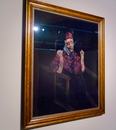 Francis Bacon Pope Study I have to admit, I struggle with Bacon. There is no denying the intensity of emotion in his canvases but I find him impenetrable and depressing. I want art to lift me up, inspire and ennoble me. This exhibition, which focuses on the `frames` in which he placed his images, again left me cold. With the exception of one painting, the one you see above (sorry about the poor reproduction). This is one of Bacon`s many studies after Velasquez`s Portrait of Pope Innocent X. For some reason Bacon was obsessed with this image and painted it again and again over decades. Many of the studies show his characteristic `scream` treatment, but this one is more muted, and the pose is different: instead of the Pope`s forearms stretched out horizontally on the chair arms (as in the Velasquez original) here they are upraised. A gesture of frustration, of stress? I prefer to see them as a frisson of triumph. `The Pope witnesses a 93rd minute Italian winner in the Euros`. Flippancy aside, I do like this painting. I like the colours, the flesh tones, the contrast between the black background and the ecclesiastical purple. No wonder Blake was inspired. The Velasquez original is one of the greatest portraits ever painted. 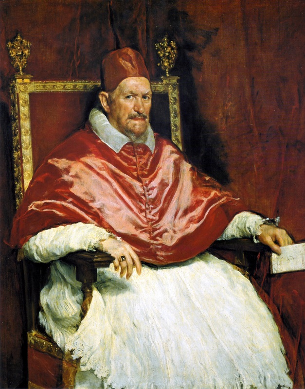 Velasquez at his mesmerising, razzle dazzle best 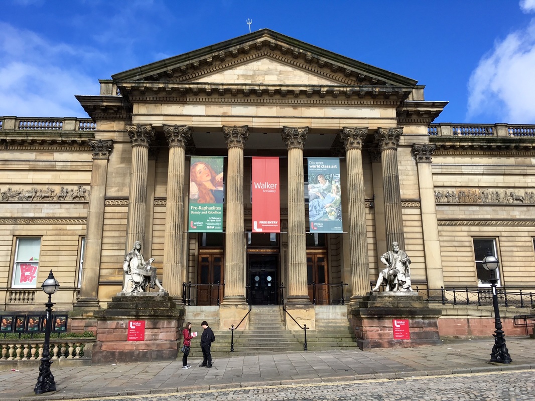 Liverpool`s Walker Art Gallery In 2008 Liverpool was named European capital of culture. This may have raised a few eyebrows `down south` but the truth is that the city has long been a patron of the arts. You may or may not be a fan of the medieval symbolism, bright hard palette and penchant for dreamy damsels with big eyes and big hair that characterises the PRB (Pre-Raphaelite Brotherhood as they rather self-importantly styled themselves), but what brings The Walker Art Gallery`s exhibition "Pre-Raphaelites: Beauty and Rebellion" http://www.liverpoolmuseums.org.uk/walker/exhibitions/preraphaelites alive is its exploration of art patronage in the era of the great Victorian industrialists. 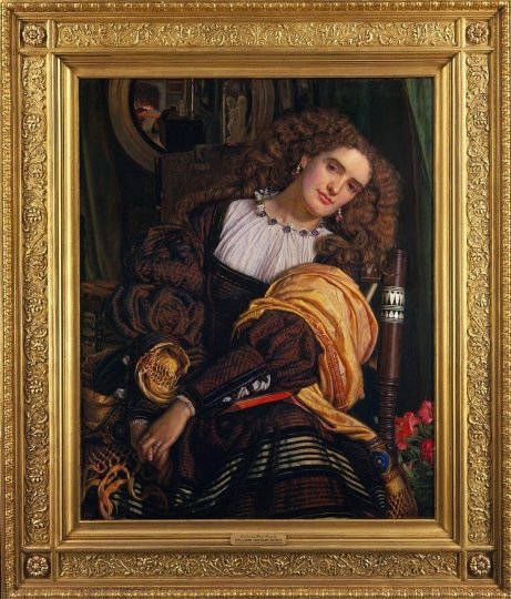 Big eyes, big hair. PRB womanhood at the Walker show. London`s Royal Academy (`RA`) had begun by treating the upstart PRB with contempt. Not so in Liverpool. They had set up their own Academy which put on an exhibition every Autumn, welcoming unsold work from the RA`s more famous Summer Exhibition. “We are saying that Liverpool was a hugely significant place for the pre-Raphaelites,” said the curator Christopher Newall. “There was a tradition of art collecting that led to great things … but more than that there was a freedom of spirit, an intellectualism, a non-conformism and self-confidence that allowed this style of art to prosper.” Behind the Liverpool Academy was a veritable slew of wealthy industrialists who embraced the rebellious PRB and started collecting their work with ingenuous abandon. The soap magnate, Lord Lever. The Birkenhead banker, George Rae. The tobacco merchant, John Miller. The ship owner, Frederick Richards Leyland. The brewer, Andrew Barclay Walker, (whose cash founded the Gallery itself). The walls of their mansions were stuffed with PRB work. Self-made men, they came to the world of art with no elitist preconceptions and they warmed to the PRB`s non-conformism. Even today the PRB enjoys a mixed reputation amongst art cognoscenti, but it has mostly been popular with the `man in the street`. In similar vein, these no-nonsense northern capitalists simply liked what they saw - realistic figurative images with vivid colour and a compelling narrative - and promptly bought what they liked. 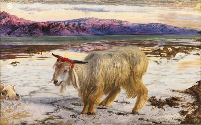 William Holman Hunt`s The Scapegoat. Yesterday it was announced that British Home Stores was going into bankruptcy, the victim not only of an outdated retailing product but of a series of rapacious owners who had milked the brand at the expense of its customers, its employees and indeed its own survival. MP`s have called this "the unacceptable face of capitalism".
I can`t answer for the business ethics of The Walker`s Victorian Liverpool magnate-art-benefactors, and no doubt there was a touch of self-interest and status-seeking in their patronage, however there is no doubt about the wonderful legacy that they have left us. Is this `enlightened capitalism`? Maybe, maybe not. But for those of us who are lucky enough to enjoy this show, it is most assuredly `acceptable`! |
AuthorSimon Dalby Archives
December 2023
Categories |
 RSS Feed